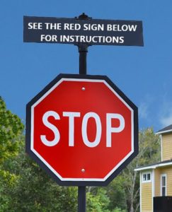
Updated for 2022. I see a lot of directional language on websites. It seems like a holdover from the early days of the web when people needed instruction on how to navigate.

What is directional language?
Directional language refers to phrases that instruct people where and how to interact with elements on a website.
Here are a few directional language examples:
- Download the report by clicking the box on the right
- See the form below and complete it to apply
- Please select from our list of services on the left
- Scroll down and click the green button
Maybe you’re wondering what’s so bad about it? It’s helpful isn’t it?
4 reasons directional language hurts the user experience
1. Good content doesn’t need instructions
Focus on the activity and its benefit for the audience. They’ll figure it out. Instead of:
“Click on any of the links below to learn more and access these marketing tools.”
Rewrite as:
“You’ll find all the tools you need to jumpstart your marketing.”
If you think you need to give instruction because no one is engaging with the content, the interaction or layout is too complex and unusable. Simplify it and you’ll eliminate the need for directions.

2. It’s not accessible content
If someone is using a screen reader, directions that refer to layout or placement, like “See the form below” will be meaningless.
3. Locations change with screen size
Mobile content is generally one column. Instructions that describe left and right only work on a desktop. So your instructions will be wrong.
4. It’s bloated
Including directional language uses more words and characters. People skim and scan, so if you can communicate with fewer words, your message is more likely to be received.
Want fewer clicks? Tell me to ‘Click here’
I’d be remiss if I didn’t highlight the worst offender when it comes to directional language. Click here.
I’m pretty sure in 2022 people know that a link is clickable. It’s the first thing you learn on a website.
I did usability tests a few years ago for a clothing retailer. One of the tasks was to order a particular size of an item, based on some measurements. All of the testers made it to the page with the link to the sizing chart – only 1 of them found it. The link stated, “Click here to find your size.”
When people scan, link text stands out since it is a different colour (and hopefully underlined). “Click here” gets seen and the rest is missed. So skip the directions and link a description of what someone will get when they make the click. In this case: “Find your size”.
Ways to communicate directions visually
In addition to language, there are ways to use typography and other design elements to communicate direction.
- Create visual hierarchy with frequent headings (H1 – H6) and whitespace to guide the eye down the page.
- Use the law of proximity: we perceive that things that are close together are more related than things that are farther apart.
- Designate a colour that is only used for call-to-action buttons.
- And it bears repeating: always put the hyperlink on the keywords that tell you what’s at the other end of the link!
Simplify your language
Directional language makes your voice sound stilted. More importantly, you are doing a disservice to your audience. Eliminate it and your content will flow better and you’ll sound more casual and approachable.
Think your content could be simplified? Start with a user experience audit.
