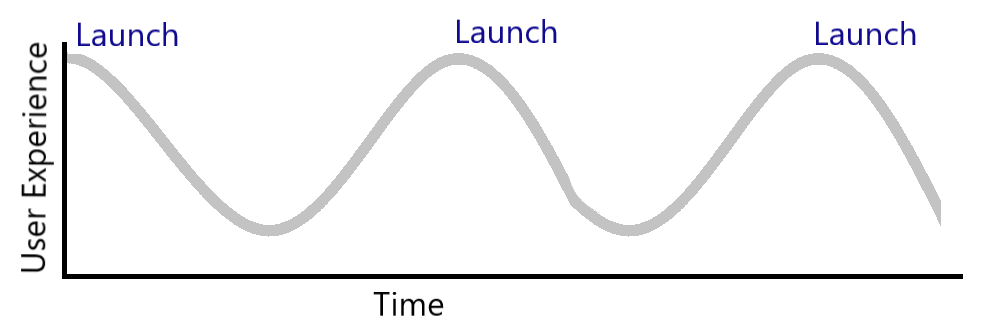
The Good-Sucks cycle was a phrase we coined at a digital agency where I used to work. You’re stuck in the cycle when you need to redesign your website every 3-4 years. Maybe shorter, maybe longer – but it’s a cycle.

I want to flesh out what it really means to constantly yo-yo from good to bad user experience, in terms of hard costs to your organization —and the invisible costs.
What do you do after a website launch?
When you launch a new website you start off at the crest: the good part of the cycle. Then, you do one of two things:
1. Nothing. You think launch is the end of the work and “if you build it they will come” takes over, or
2. You forget that your site is not for you and your decisions about what to add and update are largely ego-driven.
Both of these behaviours will put your site on a trajectory to the bottom of the trough. After a few years the user experience will have deteriorated and you’ll decide to redesign again.
In reality the curve looks more like this: the descend is more gradual, and you vault up to the crest each time you launch.

How much does a redesign cost?
Let’s add some costs to this. Now, redesigns vary greatly. I’ve worked on $3,000 sites and I’ve worked on $600,000 sites. I’ve noted that whatever price you fall into, organizations tend to stick within a close range for each subsequent redesign. Let’s pick ~$25,000.

In this scenario, over the course of 8 years you’ve spent about $75,000 on website redesign costs. Hard costs.
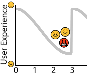
But how much business are you losing when potential customers arrive at your site after it has been neglected or abused for a few years? Let’s zoom in on the trough.

It’s difficult to quantify but make no mistake, the losses are real. If your website isn’t aligned with how your customers want to engage and buy from you, they:
- Won’t understand what you do or if you can help them
- Can’t easily find and/or understand answers to their questions
- Won’t trust you
- Hit the back button to your competitor
Yikes!
Regular website maintenance
Let me offer an alternative. You see, your website is like a puppy and needs regular care and feeding, but you’ve been treating it like a microwave.
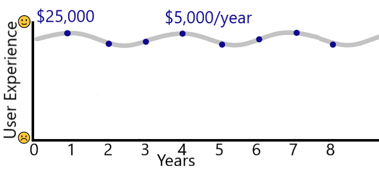
After you redesign your website and it’s sparkly and fresh, allocate about 20% of that budget for annual maintenance and stewardship activities. Things like:
- Checking for broken links and grammatical errors
- Usability testing or other user research
- Auditing to remove redundant, outdated and unloved content
- Testing on the latest browsers and devices
- Paying attention to your website analytics and actually acting on the insights
- Making someone responsible for scrutinizing every website update request to see if it’s in your customers’ best interest (and saying no)
I could go on (and I will…this will make a great future post).
ROI of a good user experience
Over 8 years the hard cost comes in around $75,000. But the value of maintaining a good user experience will be measured in your increased leads and sales and registrations and donations and whatever number matters to you.

The bottom line: To break free from the good-sucks cycle, invest regularly and consistently in your website. It will remain an asset that contributes to the growth of your organization, year after year – saving your money and your reputation.
Are you heading for the trough? Take a look at my user experience course. You can put on the brakes and start chugging back uphill – and maybe without a redesign.
P.S. Rest assured, I don’t provide design services to any of my clients. ☺
