Hey Nova Scotia companies! Did you know the province has a directive to become fully accessible by 2030? This means buildings and infrastructure, but also websites.
What does website accessibility mean?
Having an accessible website means your site is designed and developed to be inclusive of all people. Those with disabilities can access all information and functionality.
Statistics Canada (2012) reports that almost 20% Nova Scotians, 15 years and older, identify as having a disability. This is the highest provincial rate of people living with disabilities— compared to a national rate of 13.7%. (Source: The Coast)
Why would you purposely exclude 20% of your potential market? Good accessibility is good business sense.
To encourage organizations to get on board the Province is offering a “cost-shared grant to make accessibility-related improvements”. You can get up to $30,000 to cover upgrades to your website to make it more accessible. The grant information doesn’t specify which standards must be met (yet). However, the Province has committed to making their own sites compliant with WCAG (Web Content Accessibility Guidelines) 2.0 AA standards.
Designing for Inclusivity
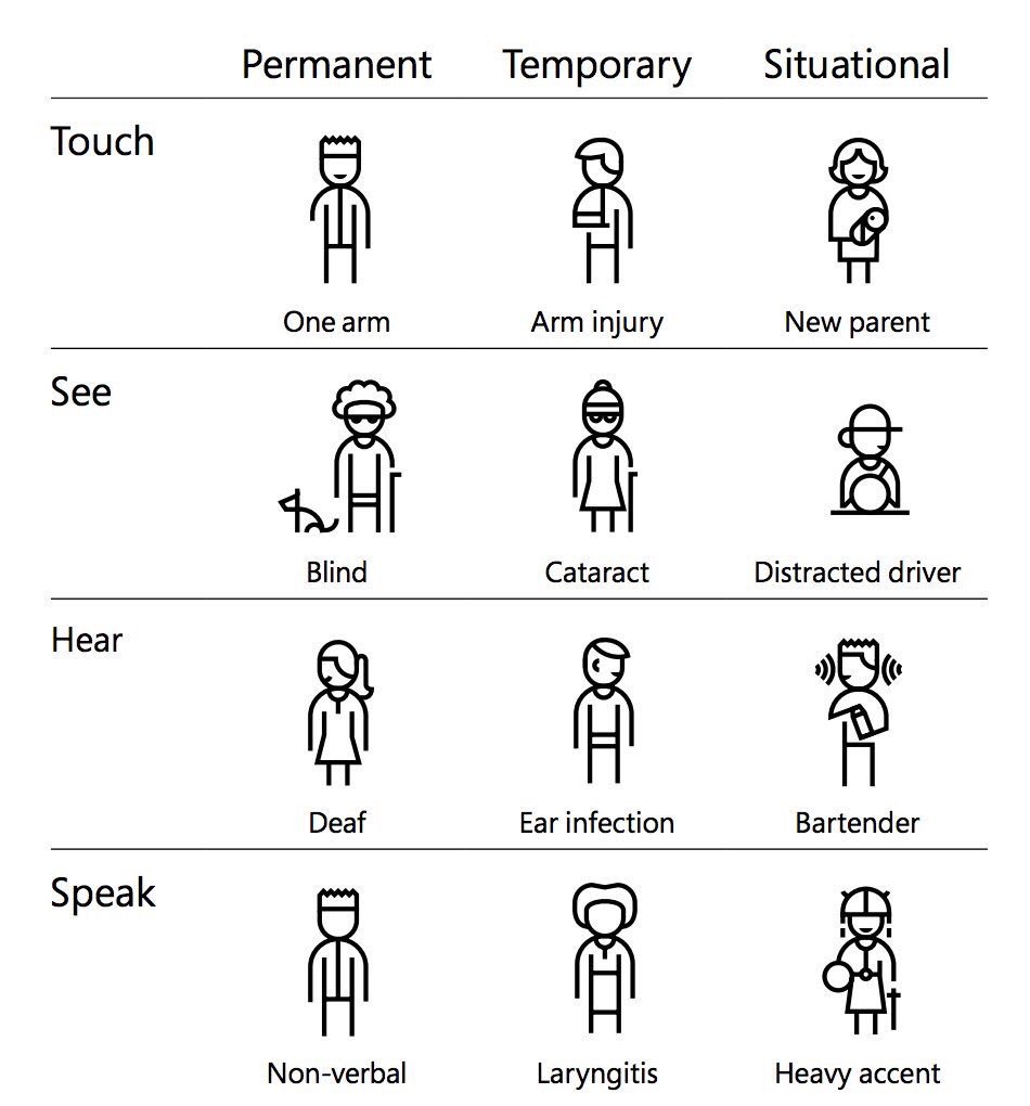
Everyone will experience accessibility challenges at some point in their lives. We tend to think of them as permanent or chronic states – an amputee for example. But what about the person who broke their arm skiing and is in a cast for 6 weeks? Or the new parent with a colicky baby who can’t be put down? They share the same challenge when trying to navigate your site with a mouse.

Microsoft’s inclusive design chart is a commendable explanation – although it is missing cognitive conditions, such as alzheimer’s (permanent), a concussion (temporary), or a migraine (situational).
4 Principles of Accessibility
Accessibility standards are guided by 4 principles: Perceivable, Operable, Understandable, Robust (POUR)
Perceivable – People must be able to process information.
Operable – People need to be able to operate websites and applications with a variety of tools.
Understandable – If people can perceive and operate a website, that doesn’t mean they can understand it.
Robust – Within limits, websites should work well enough across platforms, browsers, and devices to account for personal choice and user need.
With these in mind, let’s look at the 5 main categories of disabilities and how they impact web design and development decisions. *This is not an exhaustive list, only a representation of disabilities and complementary website accessibility best practices.
1. Visual
This includes colour blindness, low vision, blindness. On your website this means:
- Use larger fonts
- Increase spacing of typography
- Ensure adequate colour contrast between text and background
- Avoid certain colour combinations that may not be perceivable
- Use more than just colour to represent a change
- Add descriptive text for images, buttons, and infographics so screen readers can relay your content
2. Cognitive, learning and neurological
This includes mental illness, ADHD, autism spectrum disorder, memory impairments, learning disabilities, and seizures. On your website think about:
- Not using flashing gifs
- Not starting audio and video automatically
- Using plain language and writing at a lower grade level
- Avoiding pairing blue and red, which appear to ‘jump’ when placed side by side
3. Auditory
This includes deafness, hard of hearing. On your website:
- Provide transcripts or subtitles of video and audio files
- Limit background music
- Don’t start audio automatically
4. Physical (motor)
This includes tremors, joint pain disorders, paralysis, amputation. On the website:
- Increase the size of buttons and linked areas so they are easier to click
- Enable navigation by keyboard or voice so there’s no reliance on a mouse
5. Speech
This includes muteness and stuttering. On your website, don’t rely on voice alone.
As voice increases in popularity, it provides a wonderful alternative for people with motor disabilities. You cannot rely on it, however, without excluding others.
A Web for Every One
The bottom line is that accessibility is not about compliance. It’s about being inclusive and creating a web for every one. The rule of thumb is to always provide more than one indicator, method, size, or access point so that everyone can benefit. When we create we need to ask, who might be excluded by building or designing in the way we are?
For many with disabilities the web is a solution – enabling them to access information, education, entertainment and resources that might not be available otherwise. By creating an online experience that isn’t accessible, you may be creating a disability.
Becoming Accessibility Compliant
There are lots of tools to determine if your website is accessible. I like this Accessibility Check from Experte. It scans up to 500 pages on your site and provides a detailed list of what to fix. And it’s free! Figuring out what it all means and making updates to your site is where I can help, so get in touch.
