Think of all the kitten videos you would have missed out on without the humble hyperlink.
![]() Seriously though, there is no web without the hyperlink. They are actually “hypertext links”, as in “hypertext markup language” – HTML. And they are the hardest working part of your web page. Properly formatted hyperlinks:
Seriously though, there is no web without the hyperlink. They are actually “hypertext links”, as in “hypertext markup language” – HTML. And they are the hardest working part of your web page. Properly formatted hyperlinks:
- Make content more scannable and communicate your message faster
- Are essential for inclusive design and making content accessible for screen readers
- Improve search engine optimization by creating inbound link value
- Increase engagement and conversion rates
Hyperlinks are also the most abused. Read on and learn how keyword selection, colour, length, and formatting of your links can work together to improve the experience for your customers.
Hyperlinks stand out
Because we scan first and maybe read later, hyperlinks stand out with their unique colour – it’s easy to pick them out of a block of text. They help your customer decide if they want to read or not.
They are an opportunity, so stop wasting it with ‘click here’ and ‘read more’ links that don’t communicate anything. Click here and learn more are grounds for divorce, grounding, torture, dismissal, jail time, etc.
‘Click here’ is lazy, directional content. To learn more about why you shouldn’t use directional content, click here. I’m kidding. Link the text that tells you what you’ll get when you click. The reader should be able to isolate the link text and know what they will find. Learn more about why you shouldn’t use directional language.
Access denied
The real harm of those vague, non-descript links is with regard to accessibility. People who use screen readers often want to hear just the links and then decide where to click, or if they want to hear the full text. You can imagine how useful that page of ‘click heres’ will be in communicating what your page is about.
Your links also need to be coded to be accessible. Can you navigate through them with only your keyboard, using tab and enter? I’m not a coder, so here’s more on the keyboard accessibility of links.
How many links?
When you see a link you need to decide if you are going to click it or not. Even if you don’t click, your brain has momentarily disengaged from what you’re reading. Research has shown that comprehension levels of link-heavy content are lower than the same content with no links. For those who do read the copy, links slow down the process. Here’s the rule of thumb.
- If your content is complex (academia, legalese, complicated process), it is best to put a list of links at the bottom, instead of sprinkling them throughout.
- If your message is straightforward and in plain language, a few links in situ is fine.
You should aim to write at a grade 8 level or lower, so embedding links in the copy is OK, but sometimes that isn’t possible. Use your judgement.
Be mindful of having a lot of links in one paragraph. Those with motor disabilities and low vision may have difficulty making the right selection. And it’s worse on mobile when the links stack on top of one another. Text often doesn’t have the minimum height for touch and it can lead to accidental taps. To help with this, you can code in some padding around links to increase the tappable area. The same goes for your lists of links at the bottom; make sure there is enough space between lines.

Internal links
Internal links are those that lead to other pages on the same site – like the one above to my post on directional content. They are important for search engine optimization, encourage exploration of your content, and persuade people down conversion paths. When you are crafting the link text, use keywords that describe the page you are taking people to. This improves the keyword relevancy of the target page. Using my earlier example, the phrase “directional language” is in the name of the blog post and its title, so I used it in the hyperlink text.
Journey architecture
Choosing what to link to internally should not be a random act, but part of your overall content strategy. The important thing is to not leave your customers hanging. When your page is a dead-end you force your customer to re-evaluate all of your navigation (or leave). Where do you want them to go?

Each page of your site is like a Choose Your Own Adventure novel. You, as the author, can craft their journey.
Answer the question, “if you’re interested in this content, you may also be interested in this.” If you’ve prepared customer journey maps, what stage of the decision-making process does this page cater to? Add links to other content at this stage, or the next one. Persuade the customer down the path toward conversion. Google Analytics can also help you identify common conversion paths. Read more about crafting the journey architecture.
More internal linking tips:
- Don’t add too many links to the same page using the same anchor text. It will look like you’re trying to spam the search engines and you could be penalized. Vary the link text and don’t overdo it.
- Since the links go to other pages on the same site, opening in the same window is recommended.
- Make your links longer. With ‘click here’ and ‘read more’ banished from your link vocabulary, you can enjoy a bit more freedom. 4-6 words is OK.
- Put your most important keywords at the start, just as you should for title tags and headings.
Linking to external sites
![]() Should links to other websites open in a new browser window? There has been a lot of debate about this, but I recommend no. It can be disorienting and cause accessibility issues. Based on recent behaviour I’ve seen in usability testing, many people right click and open links in a new tab, anyway.
Should links to other websites open in a new browser window? There has been a lot of debate about this, but I recommend no. It can be disorienting and cause accessibility issues. Based on recent behaviour I’ve seen in usability testing, many people right click and open links in a new tab, anyway.
An exception would be if the person is in the middle of a form or other process where their work would be lost be leaving the site.
- Don’t display the URL of the site you are linking to, but link the name of the site, i.e. “Learn All about Boxer Dogs” instead of “View the All about Boxer Dogs website at http://www.allboxerinfo.com/“
- Check your external links regularly: URLs change, pages disappear and you don’t want any broken links on your site.
- Consider adding an external site icon like the one above to tell people they are clicking to a new site. If you have a lot of links that are a mix of internal, external and files, this is a good idea.
Linking to files
When linking to a file instead of another page, set the expectation for your customer. Nothing is more frustrating than clicking a link and starting to download a 15 MB PDF on your phone.
- The name of the document should form the link text
- Include the file type and the size after the link in brackets i.e. Hyperlink Cheatsheet (PDF, 1.1 MB) (It’s coming soon!). Include these details in the link for screen readers.
- Always open files in a new browser window
Colour me linked
Have you ever tried to click something you thought was a link and it wasn’t? Frustrating! Link text should be a unique colour that stands out from your body copy and is not also used for your headings. Blue (#0000EE) has established itself as the default colour for unvisited links. They should also have a visited state so you can identify if you have clicked them before. The default visited link colour is purple (#551A8B). You’ve probably benefited from this in Google when you click back to the result list (perhaps many times) and you don’t remember the names of the sites you were on.

You don’t have to use the traditional colours. If your brand palette has similar ones then you’ll probably want to save them for headings, buttons and other design elements. Please choose new, distinct link colours and apply them consistently.
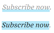
Be sure there is ample contrast with your body copy. For example dark grey text and brown or dark blue links may not be distinguishable. Don’t forget to include a hover-over state. Common practice is to use the visited link colour, or to apply an underline or a highlight.
To underline or not
In the beginning, links were underlined so they were easy to identify. The web was new it was important to draw attention to them. Recently we’ve gone through a minimalist trend, which saw the removal of the underlines. The colour was different so why did you also need the underline? It was visual noise. I supported this for awhile.
Lately I have come back to underlines. Perhaps it’s because my eyes recently decided they need magnifying glasses on top of my contact lenses and I have a new perspective. For inclusive design you shouldn’t only rely on one visual indicator. Someone who is colour blind will see the underlines and the links will be just as accessible to them.
You’re only as good as your weakest link
Hyperlinks have a tremendous impact on the user experience as they have a direct impact on attraction, engagement and conversion. And with virtually no cost and little additional effort to do well, can you afford not to?
If you’re intrigued at the idea of an internal link strategy to reach more customers, get in touch with me.
